Fancy Alert
Beautiful, customizable alert dialogs for NativeScript.
Based on:
- iOS: SCLAlertView
- Android: ColorDialog
Installation
bash
npm install @nstudio/nativescript-fancyalertDemo
| iOS | Android |
|---|---|
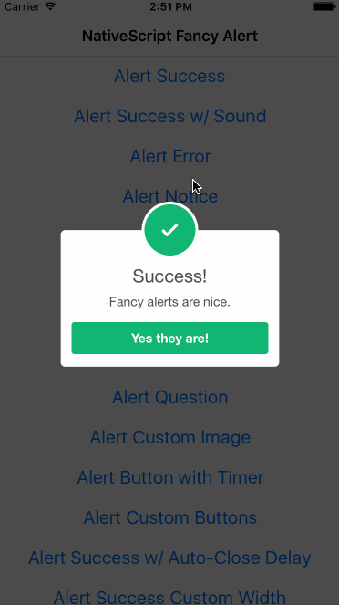 | 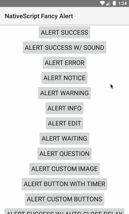 |
Usage
Basic Alerts
typescript
import { TNSFancyAlert, TNSFancyAlertButton } from '@nstudio/nativescript-fancyalert';

// Show success
TNSFancyAlert.showSuccess('Success!', 'Fancy alerts are nice.', 'Yes they are!');

// Show error
TNSFancyAlert.showError('Error!', 'Something bad happened.', 'Close');

// Show warning
TNSFancyAlert.showWarning('Warning!', 'Be careful.', 'Got it');

// Show info
TNSFancyAlert.showInfo('Info', 'Here is some information.', 'OK');

// Show notice
TNSFancyAlert.showNotice('Notice', 'Please take note.', 'Understood');
Customization (iOS)
typescript
TNSFancyAlert.showAnimationType = TNSFancyAlert.SHOW_ANIMATION_TYPES.SlideInFromLeft;
TNSFancyAlert.hideAnimationType = TNSFancyAlert.HIDE_ANIMATION_TYPES.SlideOutToRight;
TNSFancyAlert.backgroundType = TNSFancyAlert.BACKGROUND_TYPES.Blur;
TNSFancyAlert.soundURL = 'bell.mp3';
TNSFancyAlert.showSuccess('Sound?', 'You can customize animations and more.', 'Amazing!');
Custom Image
typescript
TNSFancyAlert.showCustomImage(
  'nativescript.png',
  '#2B33FF',
  'Custom Image',
  'Using your own images is nice.',
  'Yes!'
);
Custom Buttons (iOS)
typescript
let buttons = [
  new TNSFancyAlertButton({
    label: 'One',
    action: () => console.log('One'),
  }),
  new TNSFancyAlertButton({
    label: 'Two',
    action: () => console.log('Two'),
  }),
];

TNSFancyAlert.showCustomButtons(
  buttons,
  undefined,
  undefined,
  'Got Buttons?',
  "Add as many as you'd like.",
  'Ok'
);
Text Input (iOS)
typescript
TNSFancyAlert.showTextField(
  'Enter your name',
  null,
  new TNSFancyAlertButton({
    label: 'Save',
    action: (value: any) => {
      console.log(`User entered ${value}`);
    },
  }),
  undefined,
  undefined,
  'User Input?',
  'Yeah, sure we can.',
  'Ok'
);
Switch (iOS)
typescript
TNSFancyAlert.showSwitch(
  "Don't show again",
  '#58B136',
  new TNSFancyAlertButton({
    label: 'Save',
    action: (isSelected: boolean) => {
      console.log(`Switch selected: ${isSelected}`);
    },
  }),
  'switch.png',
  '#B3714F',
  'Need a switch?',
  'It can be useful.',
  'Got it.'
);
iOS Properties
| Property | Description |
|---|---|
shouldDismissOnTapOutside | Dismiss when tapped outside |
hideAnimationType | Animation type when hiding |
showAnimationType | Animation type when showing |
backgroundType | Shadow, Blur, or Transparent |
customViewColor | Overwrite buttons and borders colors |
titleColor | Custom title color |
bodyTextColor | Custom body text color |
cornerRadius | Custom corner radius |
soundURL | Play mp3 from App_Resources |
iOS Methods
showSuccess(),showError(),showNotice(),showWarning(),showInfo()showEdit(),showWaiting(),showQuestion()showCustomImage(),showCustomButtons()showTextField(),showSwitch(),showCustomView()
Android Methods
showSuccess(),showError(),showNotice(),showWarning(),showInfo()showColorDialog()- Returns a Promise
License
Apache License Version 2.0